Subverting the Ceremonial.
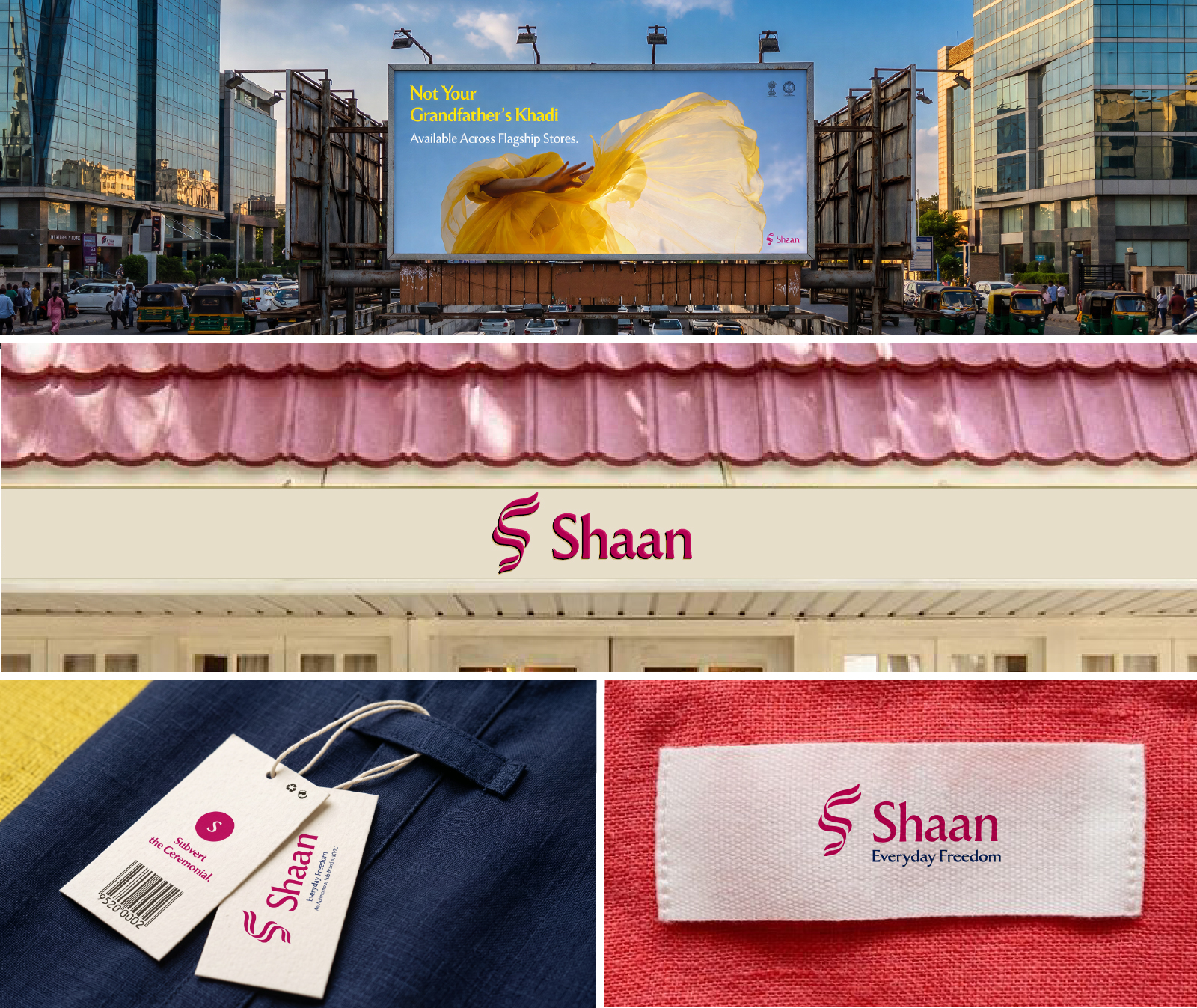
Brand Identity for Shaan, An Autonomous Sub-Brand of KVIC.

Rebuilding Handspun
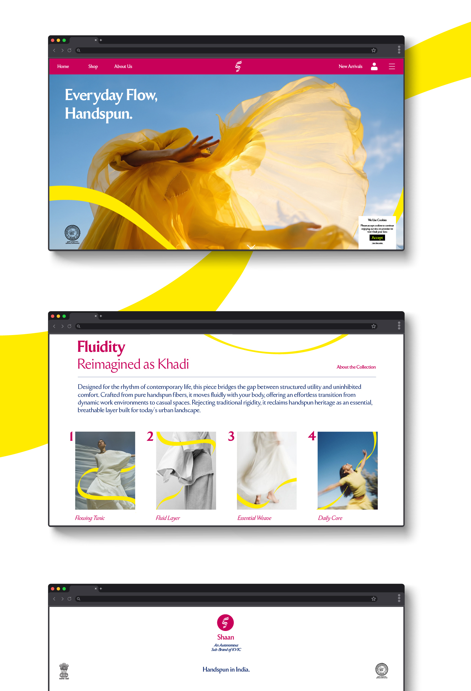
Khadi has traditionally been viewed as outdated, ceremonial, and disconnected from modern youth. To fix this, KVIC launched Shaan—a contemporary apparel sub-brand focused on daily essentials. It completely ditches the rustic heritage vibe for a sharp, modern visual identity with high-contrast typography and minimalist layouts, making sustainable fashion relevant for today's audience.
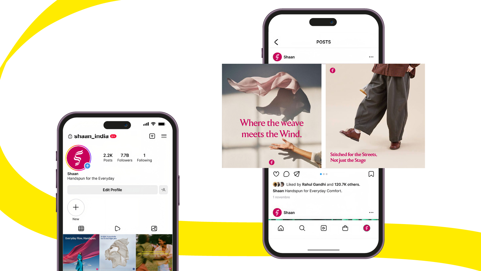
This identity reimagines the handspun ecosystem from the ground up. Stripping away the expected earthy aesthetics, we built a design system anchored in structural typography, high-contrast color, and raw minimalism. From tactile garment tags to digital touchpoints, the execution completely redefines Khadi for today's ambitious youth.
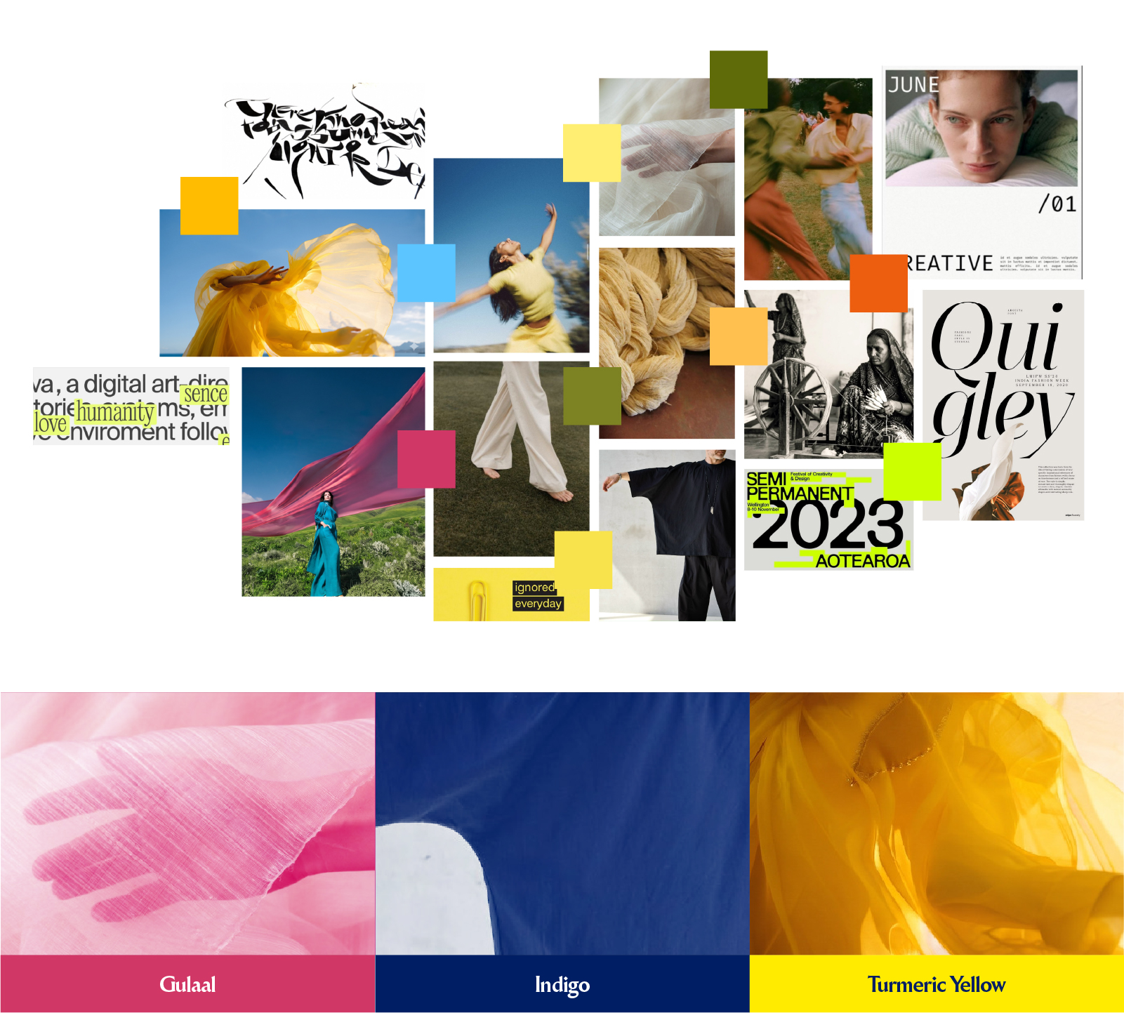
Vibrant. High-Contrast. Non-Traditional.
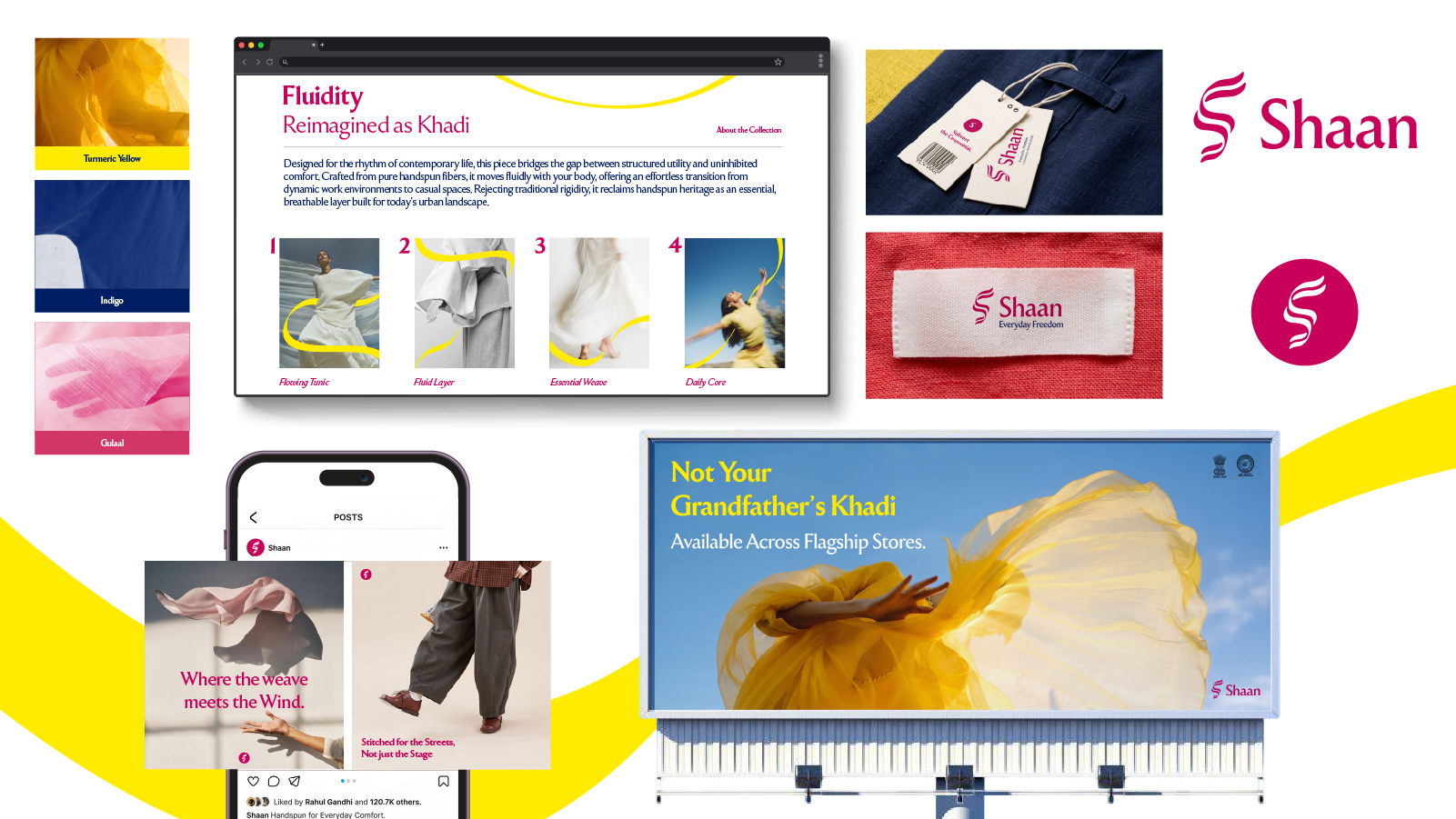
We deliberately subvert the dull, earthy expectations of sustainable fashion by electrifying heritage shades—Gulaal, Indigo and a pop of Turmeric Yellow—into sharp, confident statements of everyday expression.
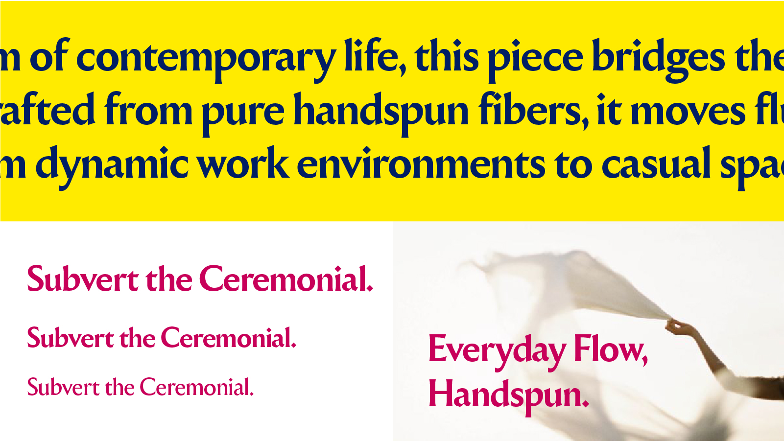
Fluid Lines. Sharp Expression.
Confident, sharp, and unapologetically non-traditional. Our typography mirrors the effortless flow of the Shaan's symbol, using crisp, flared terminals of Ceraph to bridge fluid movement with aggressive, structural clarity.